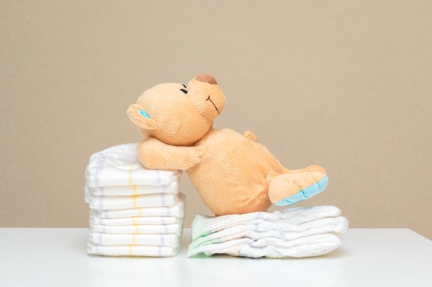
We notice signages for baby changing rooms when we are out shopping in malls, in supermarkets, dining, hospitals, public restrooms etc; But are they also da-friendly/pet-friendly, clean and hygenic? These questions concern alot of parents.
Tot-Spot app is not only saviour for the mothers but also help the dads to locate clean and dad-friendly baby changing rooms when they are out and about with their babies in case of any emergencies. The app searches accurately for the changing rooms nearby and also shows recommendations, ratings, reviews and occupancy with amenities provided in particular baby changing room.
It was a group project comprised of 3 team members:
- Vinita Prabhu - UX/UI Designer
- Nicholas Love - UX/UI Designer
- Melissa Naval - UX/UI Designer
Miro, Figma ,Invision, Trello, Google forms, Zoom calls
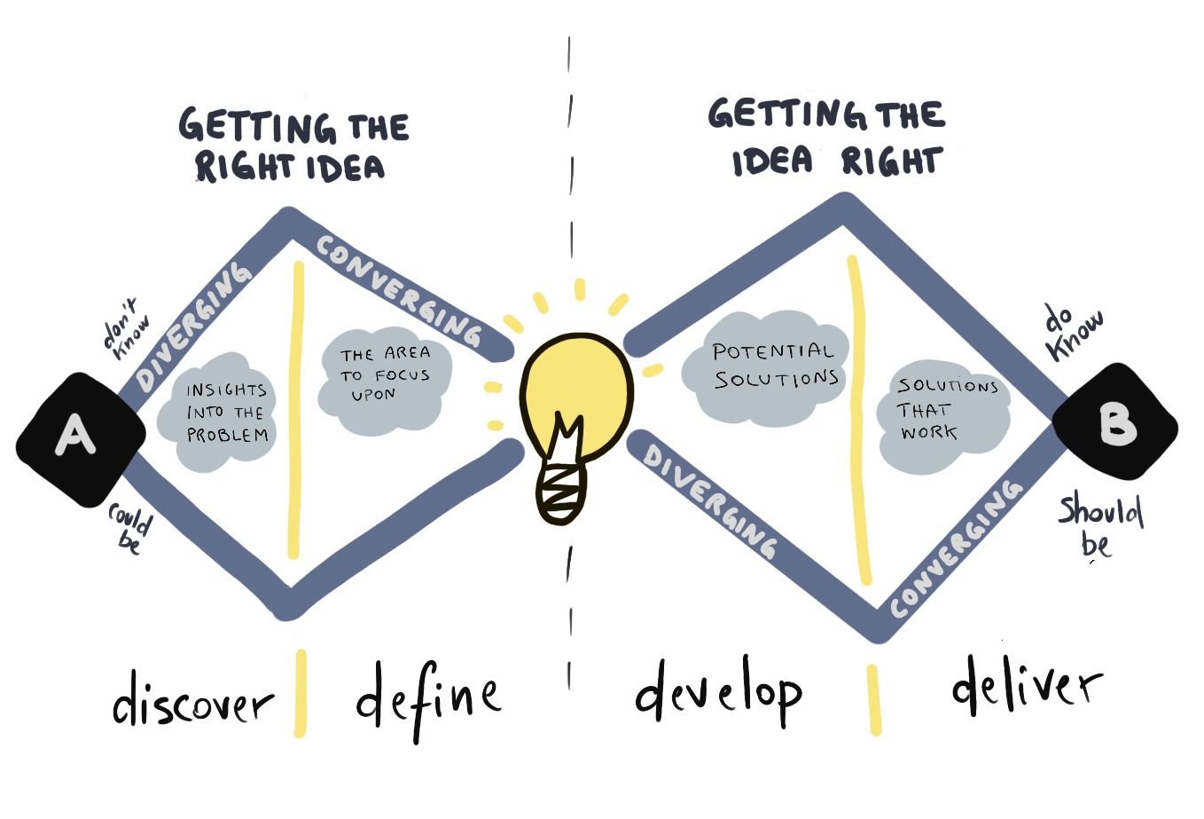
Our team followed the double-diamond design process that helped us organize ourselves for the next 3 weeks and allow us to deliver the end product on time.
Our team discussed on who are target users would be and know more about their experience while looking for baby changing room
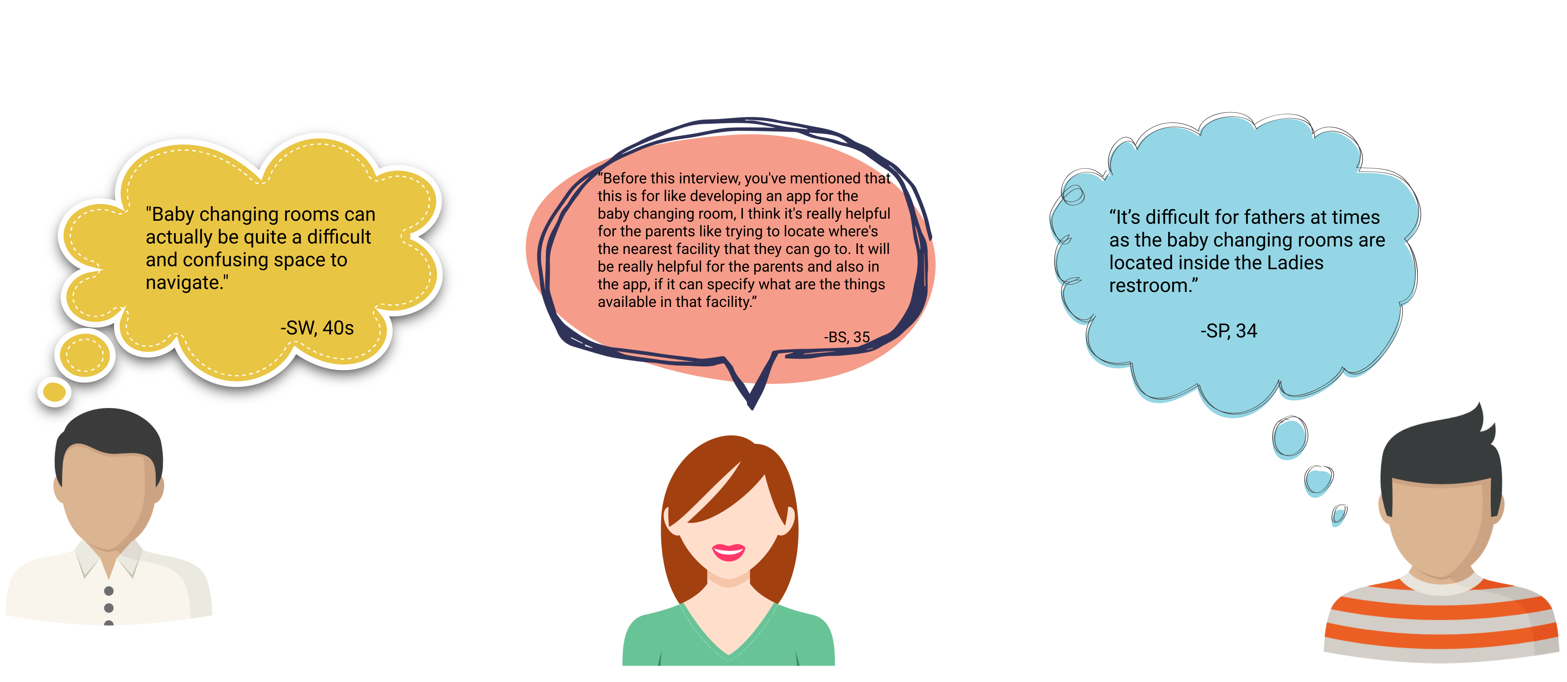
We wanted to understand from the parents mainly from Dads on how they manage changing and cleaning their babies when Mums aren't around. As noticed, the baby changing rooms are mainly located either near or inside the ladies room, we wanted to also understand user's behaviour and pain points around finding/locating baby changing room.
We drafted research questions and market survey research for user interviews together as a team to get get in depth information from our potential users.

We conducted user research interviews with 5 participants and received 20 responses for our survey circulated.
Our Research objectives are:
1. To understand how people search and discover baby changing rooms.
2. To understand the good experiences and challenges that people have when using baby changing rooms.
3. To understand the features of a good baby changing room that leaves lasting impression to the users.
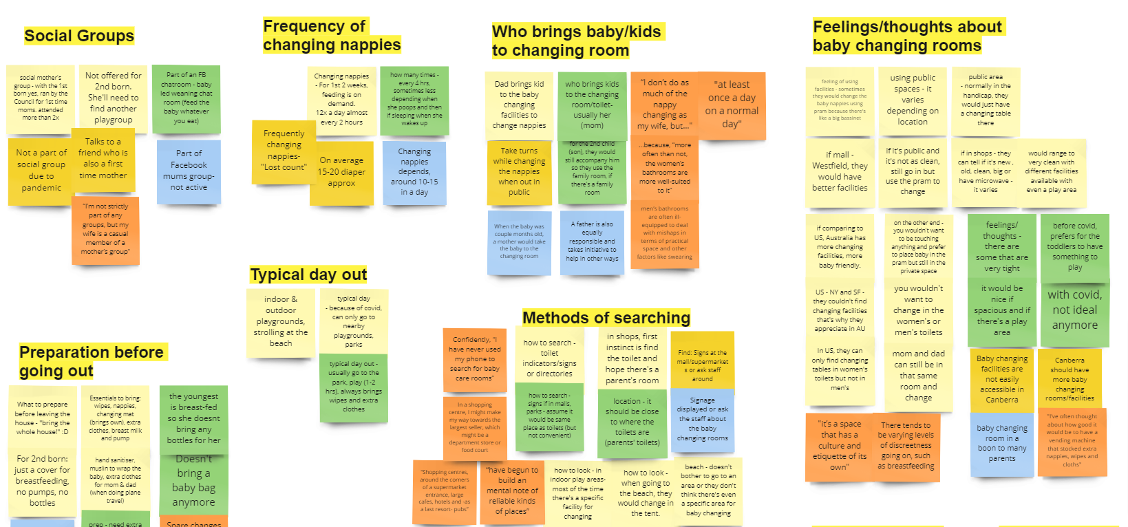
We got our key findings from our user research. They are as
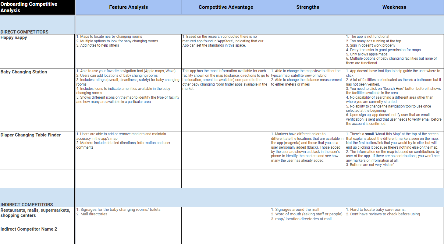
Creating a baby changing room locator app is challenging as there are many considerations while designing keeping our targeted users in mind. We compared the websites and mobile apps available in the market like: Happy Nappy mobile app, Baby changing station and Diaper changing table finder. After looking at the pros and cons of each site and mobile app, we used a heuristic analysis to evaluate their usability issues.
From our user interview notes and transcripts, we transferred them into stickes and started creating an affinity map. Once we individually put our stickies we then grouped into categories focusing on good experiences and pain-points. Few of them are:
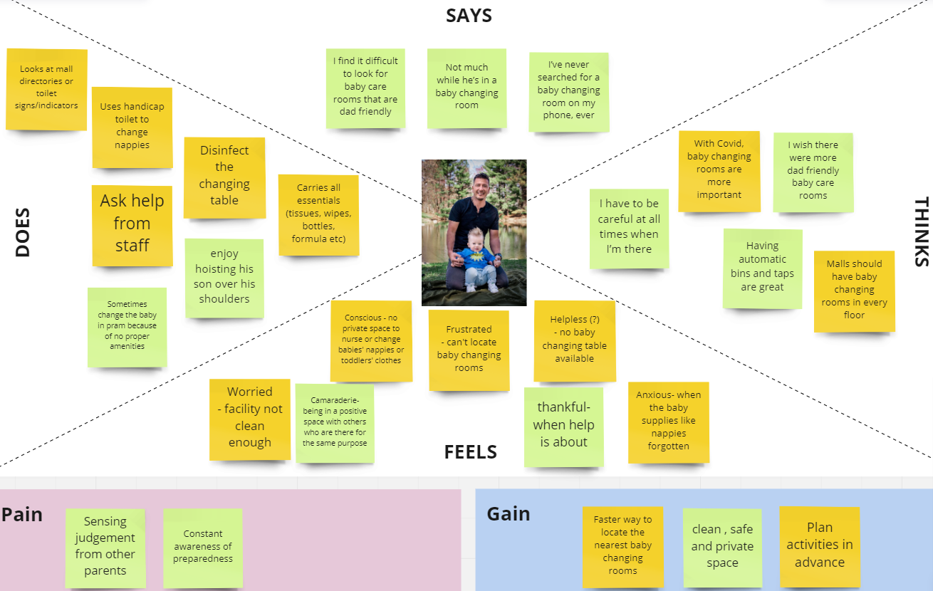
With learnings from our affinity map, we put up our empathy map and organize the thought and comments into what a typical user might think, say, do and feel, also their goals and pain points.
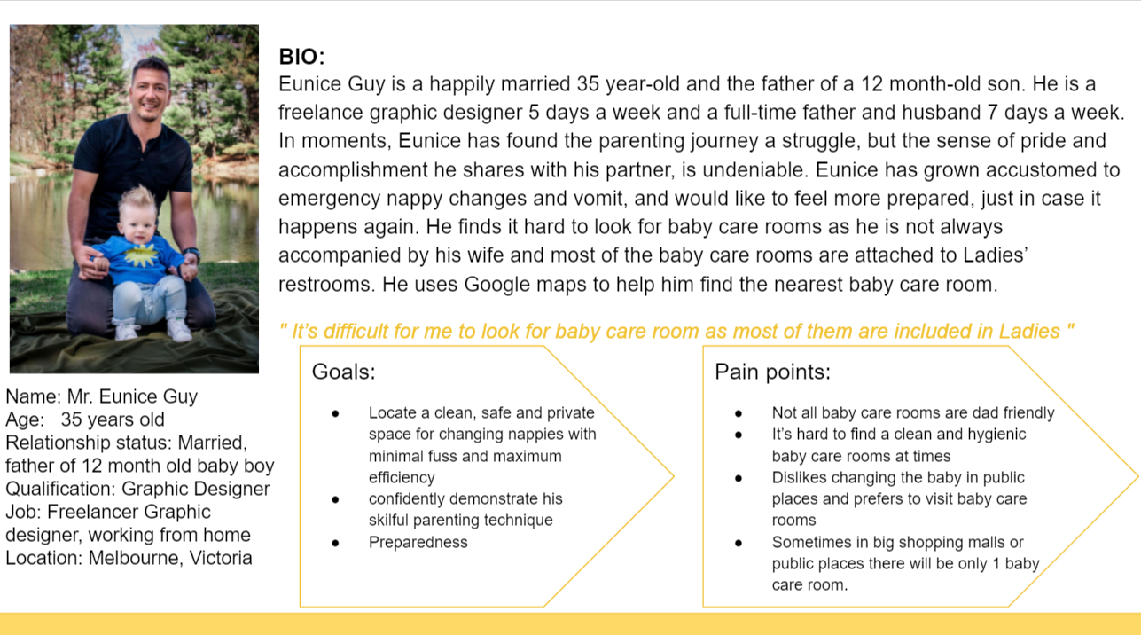
Eunice Guy is a happily married 35 year-old and the father of a 12 month-old son. Eunice has grown accustomed to emergency nappy changes and vomit, and would like to feel more prepared, just in case it happens again. He finds it hard to look for baby care rooms as he is not always accompanied by his wife and most of the baby care rooms are attached to Ladies restrooms.
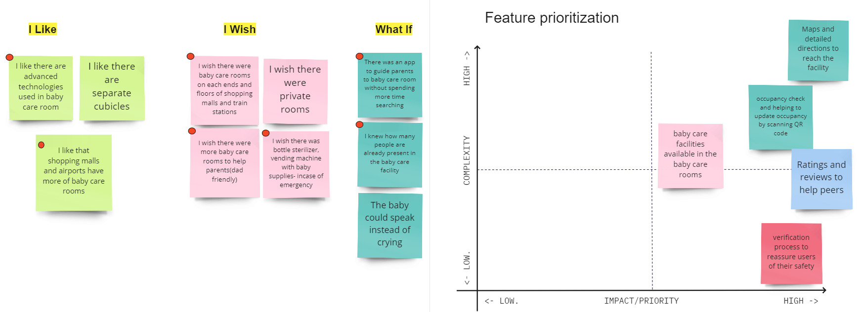
After creating our user persona we crafted initial "How might we" question to address the problem statement: "How might we be able to help the Dads quickly discover a safe,private and hygenic baby care changing room with facilities that are also dad-friendly?". We also acheived our key features with help of "I Like, I Wish and What If" method.
Before going on to the next phase we did our user-flow that gives an idea of onboarding process of the mobile application.
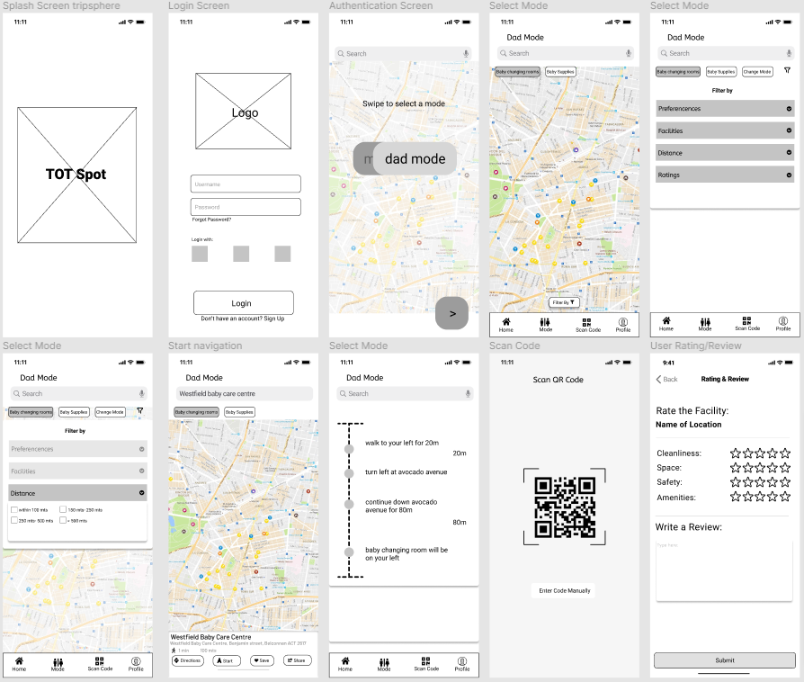
Our team than individually sketched wireframes for the mobile app that illustrates what a Dad and Mum node might look like and the way in which the user might find their nearest baby changing room. We then incorporated our selected sketches to low-fidelity wireframe which also served as the basis of our user tests. Here are some screens that display our key features:
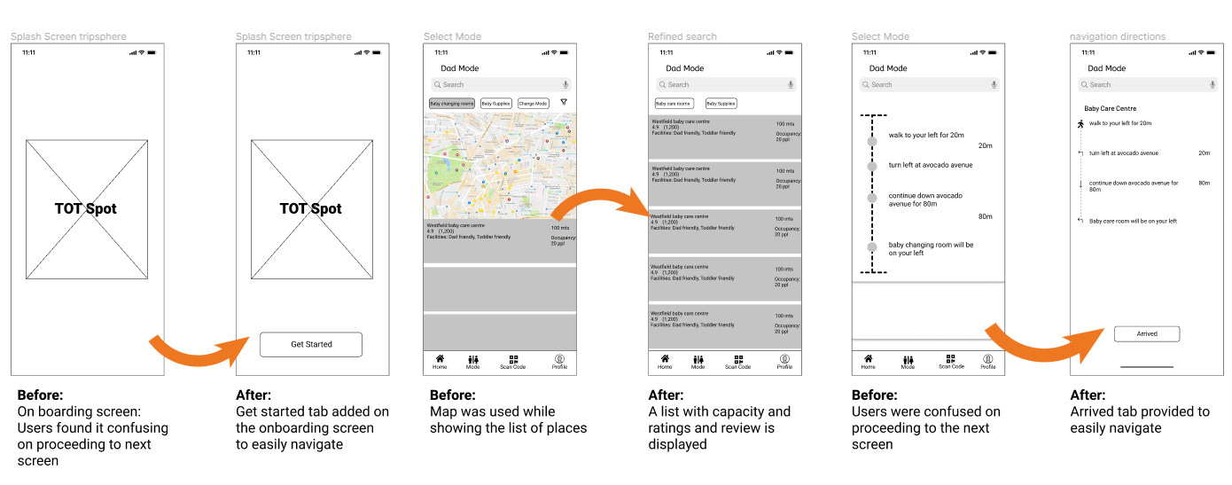
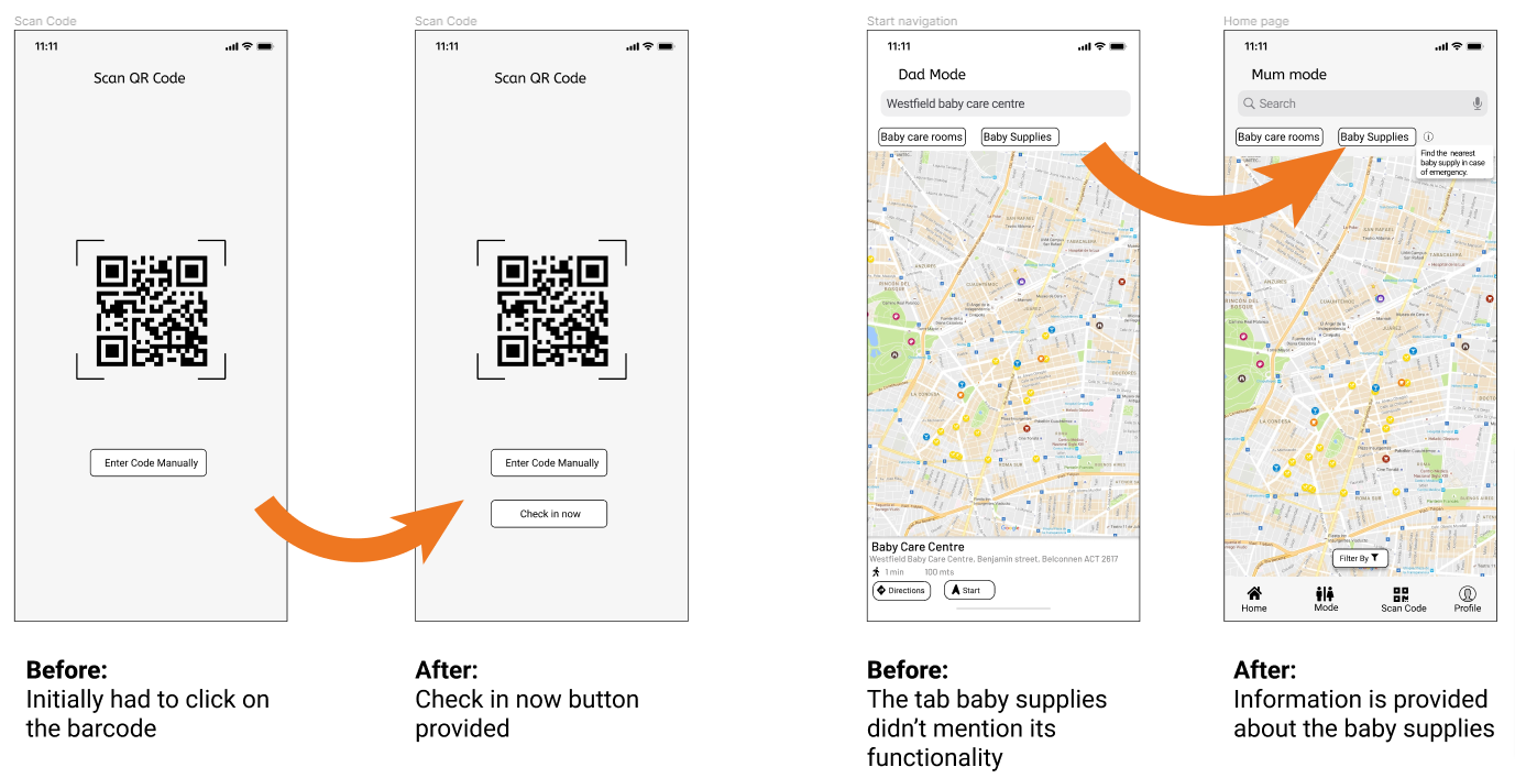
We individually conducted user tests via zoom call. During the user tests we learnt alot about the usability and functionality of our Tot-Spot app. The key feedbacks are as follows:
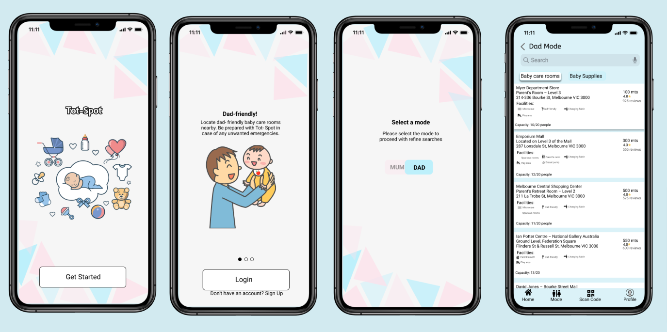
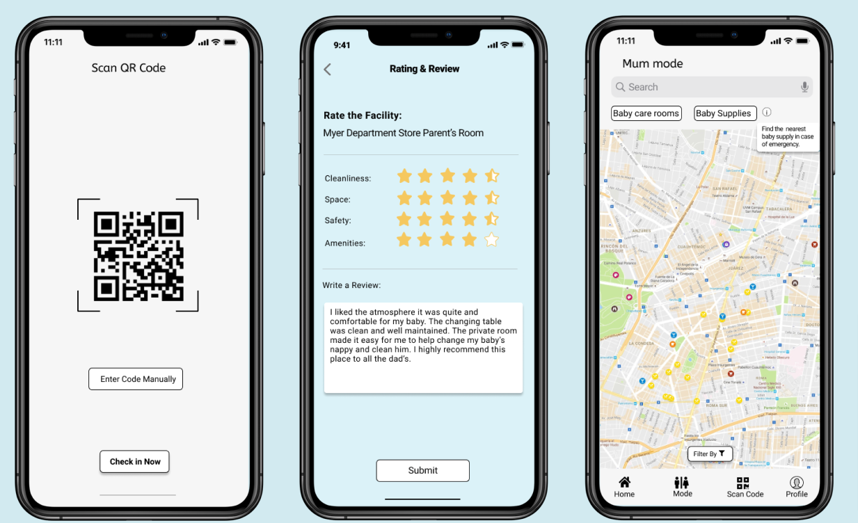
By doing couple of iterations based on user testing our team then started with high-fidelity protype. The following are the screens highlighting our key features fot the Tot-Spot mobile application.
We individually conducted user tests via zoom call. During the user tests we learnt alot about the usability and functionality of our Tot-Spot app. The key feedbacks are as follows:
- Making the Baby Supplies tab functional to locate nearby store or chemist for baby products such as diapers, baby formula, soothers etc.
- Save favourite baby care room for future use and checking if the baby changing room is not functional/closed for cleaning while searching.
There is a distinct lack of baby changing room locator apps on the market, especially those that feel reputable. An app like this would likely be a talking point across many parenting groups, and would likely be a huge help. This project was a great learning experience for all of us and left us feel confident pulling off our UX skills and practicing the methods. It taught us the importance of flexibility in practice to meet the needs of the project and delivering the project in time.